Formula 1 unleashed
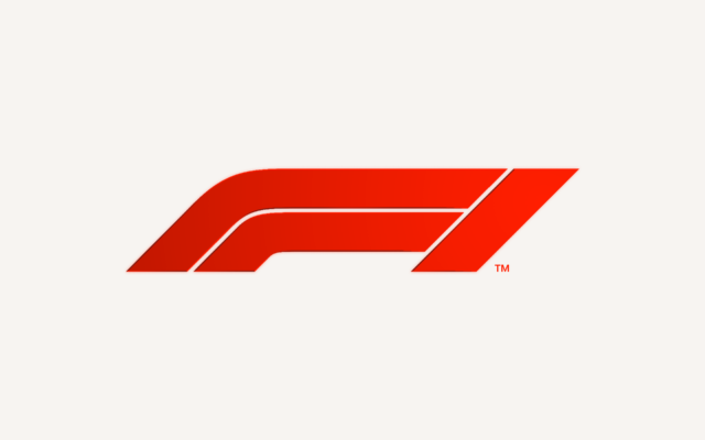
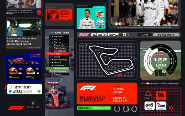
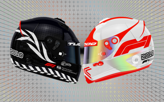
Sunday saw the launch of Formula 1’s new logo, the first step of a complete brand redesign, created by Wieden+Kennedy London.
The first rebrand in 23 years is inspired by the feedback from thousands of fans across the globe, following an in depth six-month research project. The new logo was unleashed to the world in a live end-of- season spectacle at the close of the Formula 1 Etihad Abu Dhabi Grand Prix.
Richard Turley, executive creative director of content and design, led the project for W+K London. “Creatively, the challenge was to reposition Formula 1 as a forward-facing entertainment brand, which works across a multitude of channels,” he says.
“The new mark aims to embody the core forces of Formula 1 racing: speed, attack, and control; while its sleek, sharp interlocking components celebrate the technical prowess of Formula 1 engineering teams.
“Its aesthetic is aspirational and leans into the future, but extends naturally from a rich heritage of motorsport graphics.”
Heading the sport’s redesign and brand overhaul for F1 is Ellie Norman, the brand’s first Director of Marketing. Ellie’s intent is for F1 to evoke an entirely different spirit, one that speaks to the core of why people loved the sport in the first place. That means bold changes.
She says: “When we talked to fans about what made Formula 1 amazing, what we heard was people loved the real, exhilarating, unpredictable and incomprehensibly fast elements of the sport. It was about racing. But many felt those days were behind us and that the sport has become almost impenetrable for fans, particularly new ones.
“It was clear we were going to need to address some fundamentals of our brand, if we were to realise our ambition to make Formula 1 a major entertainment player and claim our rights to be the global media brand we should be. What we say and do now is so important for our future, but it must always be driven by our fans. They come first.”
Creative Review sat down with Richard to find out more about the project, see that interview here.
Look out for much more to come in 2018.


