
Data is Beautiful
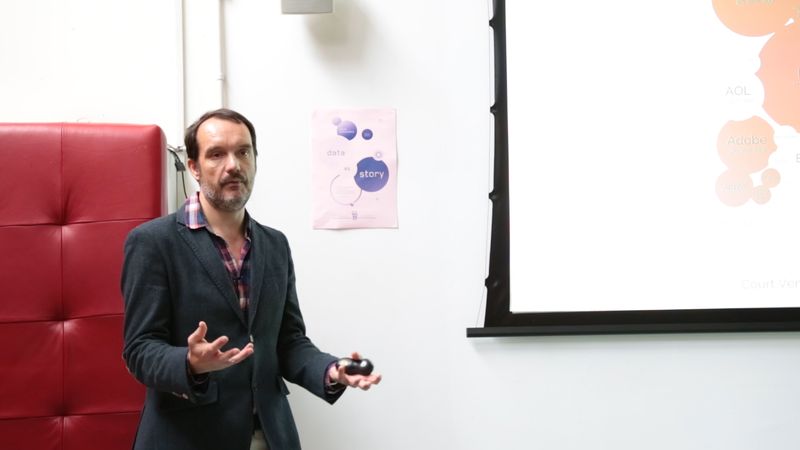
Author and designer David McCandless of Information is Beautiful fame visited our agency this morning as part of our ongoing series on storytelling. Over breakfast and a series of data visualisation graphics, McCandless showed us how sometimes dry, random seeming raw data can open up compelling narratives. For instance, what periods of the year trend toward breakups, according to Facebook status updates, and why? And what happens when you look at the billions of dollars and pounds spent on military force versus GDP? The connections aren’t always obvious and don’t always correlate directly, but they can reveal interesting stories.
For more on David McCandless and data visualisation, visit www.informationisbeautiful.net. Thanks to David for stopping by today!